Radbag stands for crazy and funny products, combined with a slightly over the top view of things. Aiming for the mobile market, the existing webshop was redesigned for a responsive approach.
Always maintaining the Radbag-Attitude, the result comes with a strong focus on exploration and stimulation, using playful shapes and bright colors. The screens below show a slightly revised version.
Basic shape
A slightly modified hexagon serves as basic shape, which appears throughout the layout. With the Radbag shopping bag as starting element, several other icons, such as gift box or camera evolved from it.
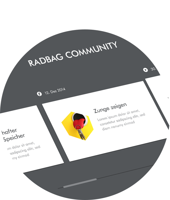
Vibrant community
With a focus on user-generated content, the Radbag-Blog offers a platform for an active community. The landingpage featuring the most recent entries as own section.